Cosmetics and personal care stores are more than retail environments; they are spaces where beauty, trust, cleanliness, and emotional connection intersect. The Saye Cosmetics & Personal Care Store was designed with this understanding in mind. Developed and executed by Ribo Architecture Studio, the project aims to create a refined retail experience in which architecture supports both brand identity and user experience.
This project explores the relationship between modern interior architecture, spatial psychology, and commercial functionality—where design decisions directly influence customer perception and behavior.
Design Concept: Simplicity, Clarity, and Product Focus
The core concept behind the Saye store is the creation of a calm, neutral, and purposeful environment—one that enhances the presence of the products rather than competing with them. Architecture here acts as a silent framework, allowing the brand and merchandise to take center stage.
The design is based on three guiding principles:
Spatial clarity
Functional legibility
Visual calm
Through the elimination of unnecessary elements, the space achieves a clean and intuitive flow for visitors.
Spatial Organization and Plan Logic
The store layout was carefully structured to guide customers naturally through the space. Circulation paths are clear and intuitive, encouraging exploration without confusion.
Key spatial strategies include:
Logical product zoning
Clear sightlines across the interior
Defined pause points for product testing and interaction
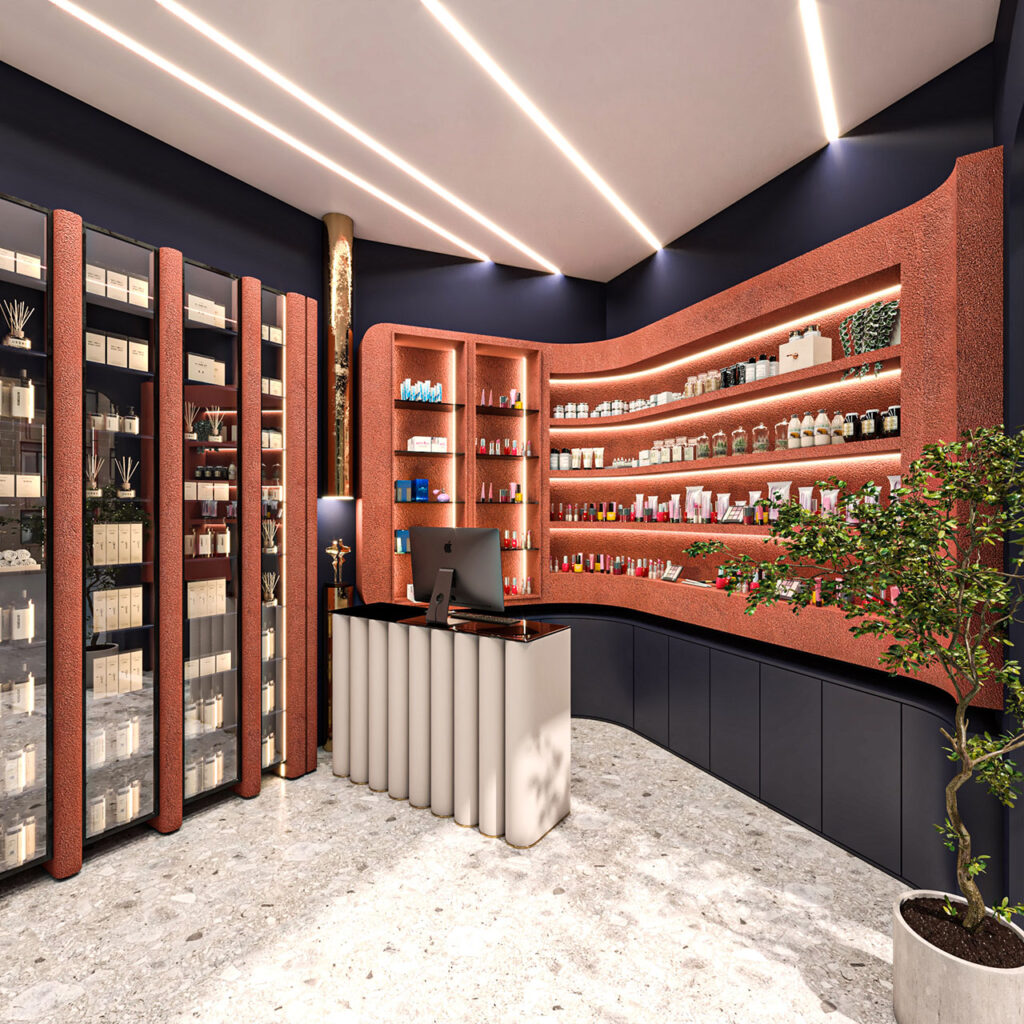
Shelving, display units, and counters are arranged in a rhythmic and orderly manner, reinforcing a sense of cleanliness and trust—essential qualities in cosmetics retail environments.
Materiality and Color: A Soft Minimalist Language
Material selection played a central role in shaping the store’s atmosphere. Ribo Architecture Studio sought a balance between contemporary minimalism and a sense of softness appropriate to the brand.
Design highlights include:
Smooth, hygienic, and easy-to-maintain surfaces
Neutral and light-toned materials to enhance brightness
Subtle textures that add depth without visual noise
The restrained color palette aligns with the visual identity of the Saye brand, allowing products to remain visually dominant.
Lighting Design: Enhancing Perception and Experience
Lighting is a critical design element in cosmetics retail, as it directly affects color accuracy, product perception, and user comfort. In the Saye store, lighting was treated as an architectural tool rather than a decorative afterthought.
The lighting strategy includes:
Uniform ambient lighting for overall spatial comfort
Accent lighting to highlight products and displays
Carefully selected color temperature to preserve true product colors
The result is a bright, precise, and user-centered environment that supports confident purchasing decisions.
Brand Identity Through Architecture
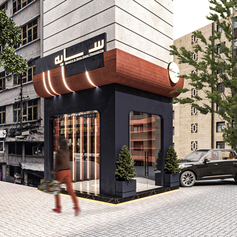
One of the primary goals of Ribo Architecture Studio was to translate the Saye brand identity into architectural language. Through form, proportion, rhythm, and materiality, the space communicates the brand’s values without relying on overt graphics or signage.
This project demonstrates how interior architecture can function as a powerful tool for spatial branding, creating an immediate and intuitive connection between the user and the brand.
Conclusion: Architecture in Service of Experience
The Saye Cosmetics & Personal Care Store reflects Ribo Architecture Studio’s approach to commercial architecture—where design is driven by clarity, human experience, and brand authenticity.
At Ribo Architecture Studio, we believe that successful architecture is not defined solely by form, but by the quality of experience it creates. The Saye store embodies this philosophy through a refined, modern, and human-centered design that balances aesthetic restraint with commercial effectiveness.


No comments yet.